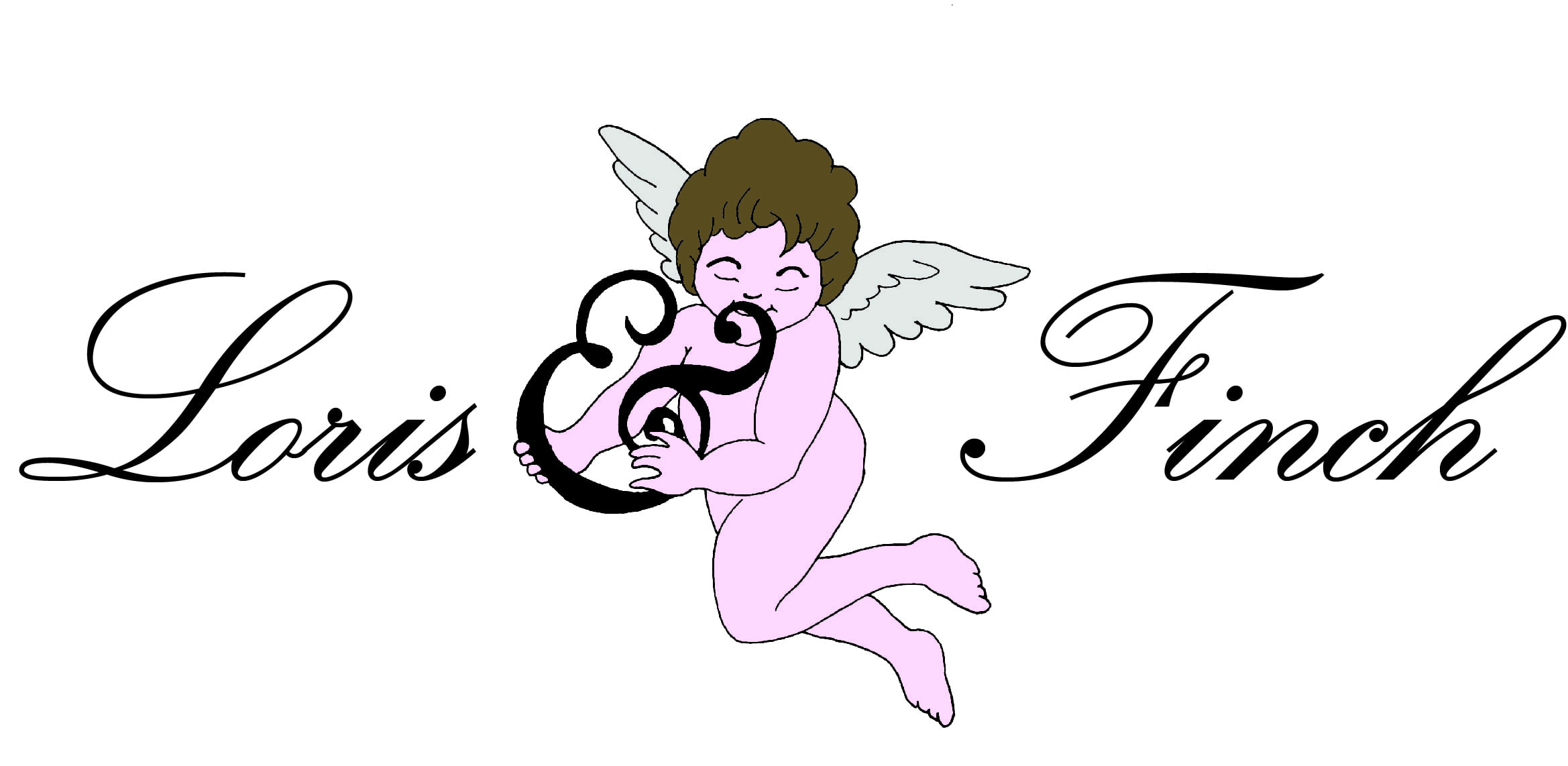
![]() Once I digitalised my work, I added colour to the cherub and thought next about the typography of the company name. It needs to display class without trying too hard. Comparing my idea of the ideal type for this company to that of the estate agents I have previously looked, it does seem to go against what is considered the norm in terms of extravagance of type, Fine and Country for example, use an elegant yet not necessarily an extravagant type for their logo. However, Loris and Finch may be like the company in terms of being based in Lincolnshire and marketing expensive properties, however Loris and Finch go beyond that in specialising in older building and ‘character’ properties therefore there is reason for me to be looking outside of the usual styles of type used in company logos.
Once I digitalised my work, I added colour to the cherub and thought next about the typography of the company name. It needs to display class without trying too hard. Comparing my idea of the ideal type for this company to that of the estate agents I have previously looked, it does seem to go against what is considered the norm in terms of extravagance of type, Fine and Country for example, use an elegant yet not necessarily an extravagant type for their logo. However, Loris and Finch may be like the company in terms of being based in Lincolnshire and marketing expensive properties, however Loris and Finch go beyond that in specialising in older building and ‘character’ properties therefore there is reason for me to be looking outside of the usual styles of type used in company logos.
I then went on to look at the different types available and narrowed it down to the three below. The first, Kunstler Script, I liked however, I did not like the way the width of the text changed throughout each letter. The second, Edwardian Script Itc, I found to be a bit too ornate, I thought that it looked a little overwhelming and was just too much for a company logo. And the third, Palace Script Mt, I was happy with, although the width of the text throughout seemed a bit slim, that was easily rectified, which was not possible with the first typeface as the width was not so consistent throughout.