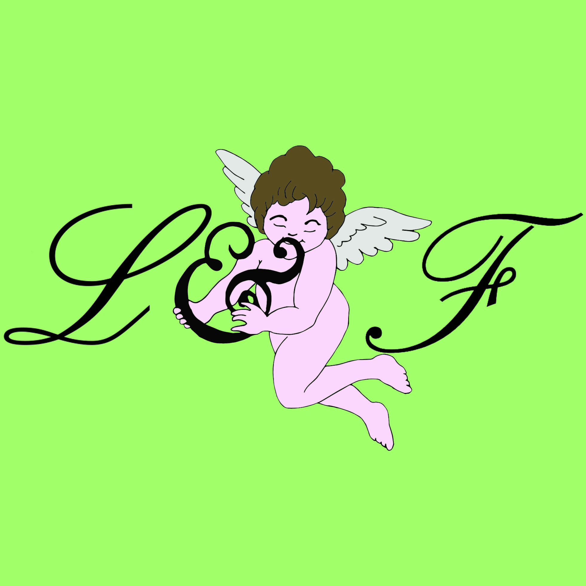
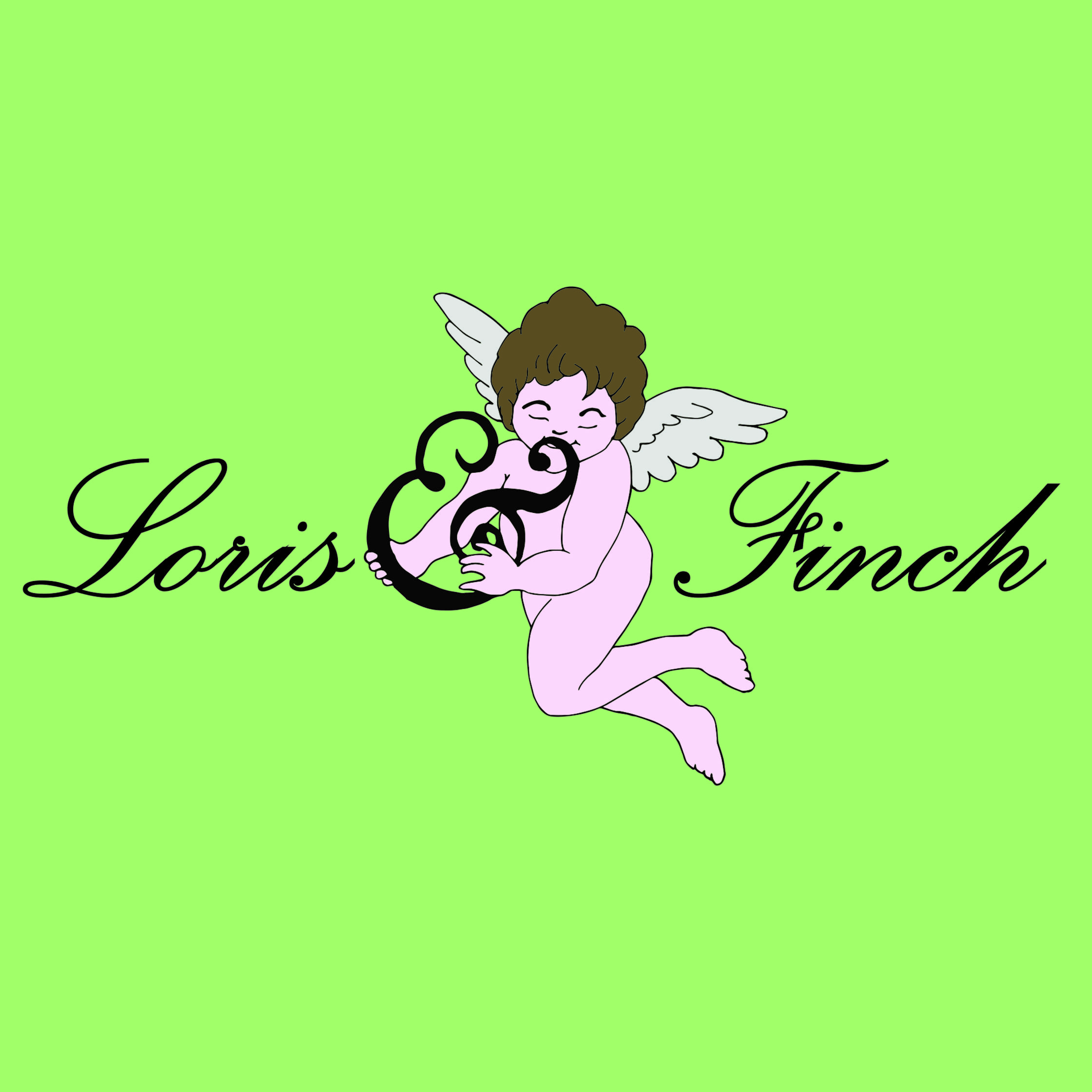
I then experimented with the logo a bit by taking out the whole words and just using the first letters of each name, both designs could be incorporated into the company’s package. In some circumstances it may not be viable to use the logo on the right and the left one may work better, for instance, on a computer, when the Loris & Finch website is open the small logo on the tab would hold the logo on the left better than the right as it is such a small image, it would need something a bit more simple and bold. And as the two logos are very similar, they will work together and both be recognisable.