The next thing to do was to make a base for my Christmas card and then turn the text and filling white. I first placed the text on a red background, thinking it would be appropriate as red can be interpreted as a Christmas colour. However after putting the text on the red background and thinking about what design I wanted to use to decorate the card I soon changed my mind about the colour I had chosen.

Monthly Archives: November 2015
Shading
 I have now filled in the letters I am most happy with, so that I can scan them all in and piece the whole title together.
Uppercase letters
I then began to think about what I was going to do with my uppercase letters. When looking at the Happy Halloween text I thought that if the text was turned white it could resemble snow falling, and as I had already started with a holiday theme I decided to design my uppercase letters to create a Christmas card.
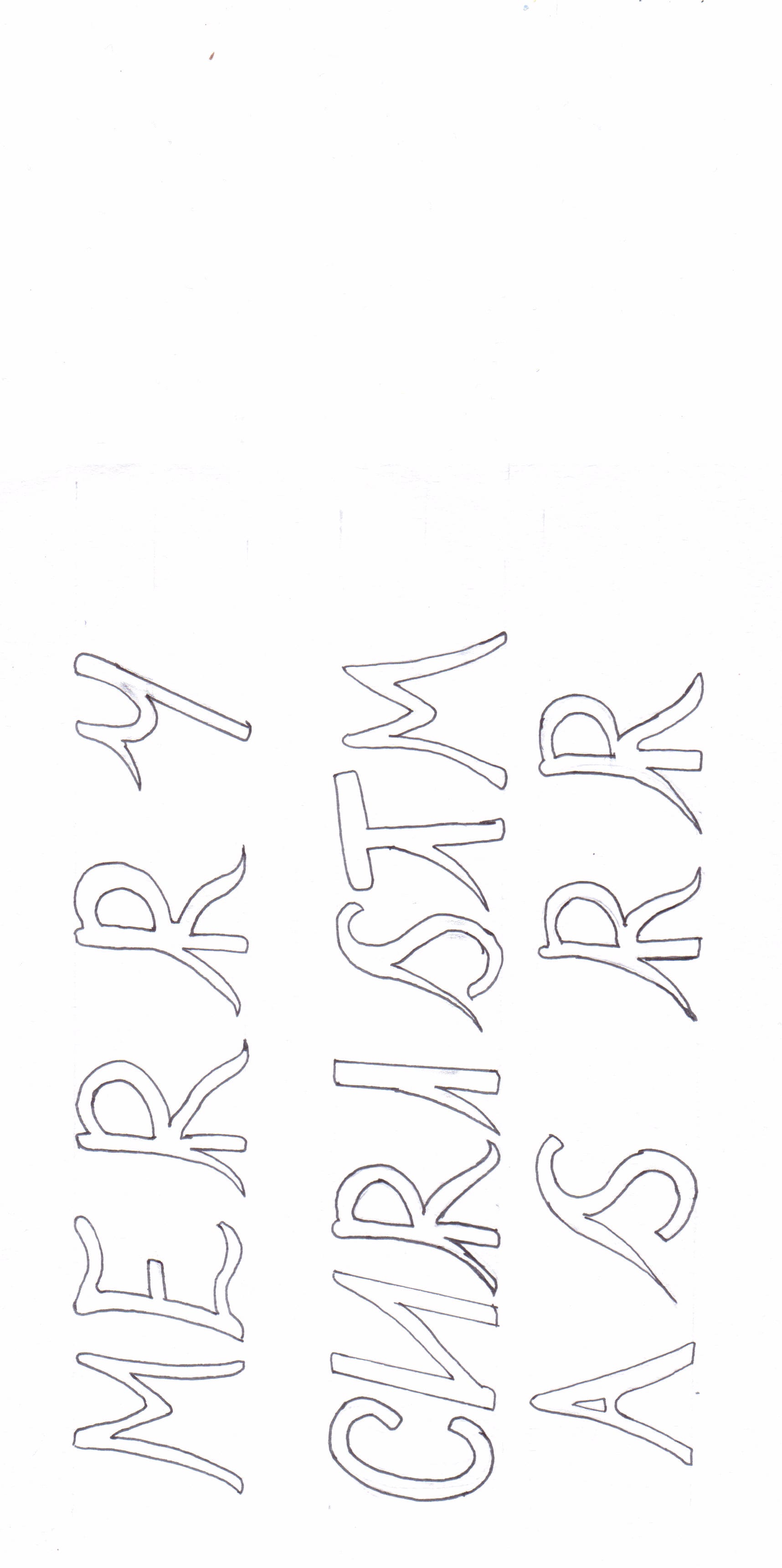
Below I have started to draw the letters out, on this particular attempt I was unsatisfied with the design of the letter R and so after completing the title I had a couple more attempts at drawing it to a better standard.
Adding a gradient
 Above is the outcome of my idea to play on the strengths of both the red and black greetings card. I am happy with this outcome as both the type and design stand out. However, I still had an issue with the gradient, I was not entirely satisfied with what I had produced and thought that there were still further improvements that could be made. I went back to Illustrator and adjusted the level of the gradient, making the red look darker, but I was much happier with this outcome and so I am satisfied with it. Below is the final outcome.
My greetings card


Once I had completed both my type and the design for my greetings card I thought I would have a play with the colour again to see what my preference was on the look of the cards in opposite colours, After a lot of frustration, I concluded that each card had strengths and weaknesses. The corpse bride looked better against the black whereas the type is a lot clearer as black against red. This is where I thought about playing to the strengths of each one.