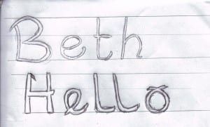
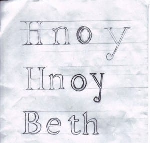
After looking at different styles of my own handwriting I decided that the typeface I wanted to create was one that I had taken some care in writing out, although the type looks flawed despite every intention being to make it look neat, I thought that the irony worked as a strength. Although it is a style that should look perfect, it doesn’t, making it quite unlike existing typefaces. After writing it out I filled in in and compare the new filled in type to the hollow one I had started with. Which got me thinking about what I was going to use to put my type into context and I came to the conclusion that my type did not have to be completely filled in to make it, I could play around with it as I decide what I want to do with it.


