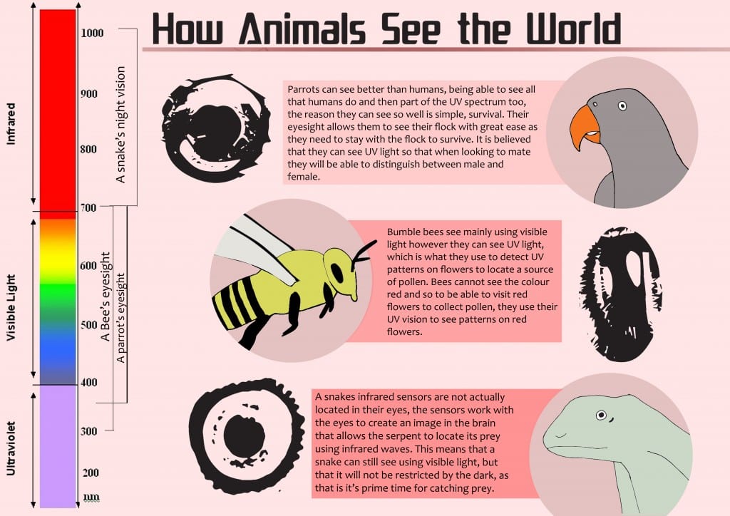
I decided to incorporate my infographic into my poster rather than the other platforms. After looking at the info graphics on the science llama website, I had a good idea of how I wanted to design my own. I used photographs to digitalise the animals so that they could feature in my infographic. And I also used different colour shadings to separate the information a bit. 
Category Archives: MFDV
My website design
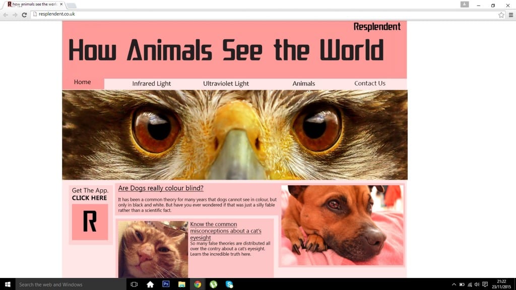
This is my finished website design. I took a lot of inspiration from the research that I had previously done and that is clearly reflected in my work. By using different shades to box of things on the website it shows what things will link to a new page. The layout is clearly set and so the website would be easy to navigate and understand. Making it ideal for any user.
Website Images
When designing the layout for my desktop view I concluded, after carrying out research on modern website designs, that it would be most effective to include photographs in my work. I have used a combination of my own images and those that I have found online. For the banner image on my website design, I used a photograph I found on a website called Page Resource. However the other images were my own, taken of my pets.
Pages
Eyes
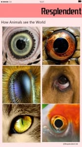
I used some images that I found online to feature in my app design. I have chosen to feature photographs of the eyes of different animals in my app design as a form of link to each page within the app; When an eye is selected it would load up the page with the information regarding that particular type of animal. Below are the links to the sources.
Dog: http://pets.thenest.com/eye-allergies-dogs-7084.html
Cat: http://www.lightstalking.com/cats-eyes/
Fish: http://www.coolanimalworld.com/page/11/

